Decorating With Color:
Best Practices
Decorating with color and paint: learn the basic principles that professional interior designers and home decorators have discovered over the years.
When it comes to decorating with color, the most successful room color schemes are those which do not attempt to be dramatic. Insistent patterns soon tire the eyes. Impressive furniture quickly becomes oppressive.
The quality to strive for in painting and decorating of a room is livability rather than drama - especially if you are a beginner.
Livability has a number of basic elements. If you always keep the following points in mind when planning your decoration, you cannot fail to create rooms that will be comfortable and attractive for you, your family, and your friends.
Color Harmonies
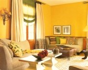
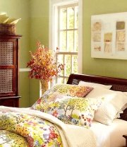
Home decorating color schemes are worked out by means of various color harmonies. The three most used harmonies for decorating with color are monochromatic/dominant, analogous and complementarty harmonies.
In monochromatic or dominant color palette, different tones of the same color are used, as in a room done in beige, tan, and brown.
Analogous color scheme is one that uses two or more consecutive colors on the color wheel, such as blue, blue-green, green.
Both monochromatic and analogous harmonies may prove lacking in an interesting contrast of color qualities.
Complementary color scheme is obtained by combining a color and its complement on the opposite side of the color wheel, as red and green.
Color Placement
Probably more rooms are decorated in complementary colors than in the other harmonies, as they make for a balanced retinal stimulation and for an interesting variety and contrast.
A room all warm or all cool, all active or all passive, unless done with the utmost skill, eventually becomes annoying - something to keep in mind when decorating with color.
If two primary colors of equal value are used together in a scheme, the result may be confusing, since the contrast will be so sharp as to fatique all the nerve endings. Hence there should be the right proportion of each color and its shades and tints.
Generally, receding colors should be used for the large masses of background with active advancing colors for the small areas.
Tints should be used generally for large masses of colors except when a dark background (shade) is used advisedly to achieve a certain desired effect.
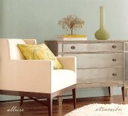
Color Contrast
If the background is light, there should be dark notes in the furnishings for interesting contrast. If the background is dark, furnishings and accessories in high value (tints) will effect a suitable contrast.
When decorating with color, always remember that the proportions of contrast must be subtle and not equal.
A light color will appear lighter against a dark background, and a dark color will appear darker against a light background.
Color Accents
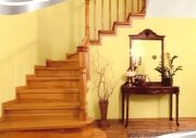
In general, a room should progress from dark floors to somewhat ligher walls to lighter ceiling. But it is becoming popular to have the ceiling - even in period decoration - a paler tint of the wall color rather than white.
Unless desirable as a shock spot of color, accent colors should be repeated more than once at different levels.
Occasionally it is interesting to have one spot of analogous color in a complementary color scheme, if the accent is worthy of the job it has to do and sufficiently important for the job.
For instance, in a living room done in reds and greens one might have a very simple, very beautiful turquoise-blue lamp of adequate size. Or the shock accent could well be a proper-sized picture or wall hanging.
Do not, however, have shock accents throughout the entire house. They may seem interesting at first but eventually become irritating.
Color Effects
In combining shades and tints of a color with other colors, it is well to remember that bright or pure colors on a dull ground of the same hue or of any hue not complementary, will deaden the dull color (for example, a bright green on a dull green, on a dull blue, or on a dull yellow). The dull color will also affect the brightness of the pure color.
This reaction of colors is owing to the fact that the bright color throws its complementary color into the dull color.
Thus a red will throw its complementary green into the green background, making it brighter, but a green thrown into a blue or yellow background would make it duller.
Color Flow
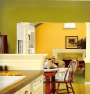
When decorating with color, there should be unity in the entire house, particularly in open concept homes, or if the rooms are connected by open doorways.
This color unity is not so necessary between one floor and another except that the hall decorating scheme on the first floor will undoubtedly be carried up to the second floor. Because of this there will be color transition.
In the small house or apartment the use of the same color or slightly varying tones of the same color as backgrounds will give unity. An effect of monotony is avoided through the use of different color in the accessories of adjoining rooms.
Sometimes it is advisable to reverse the color schemes, that is, have the background color of one room as the accent color in the adjoining room, using different values of the colors of contrasting interest.
Color Transitions
The transition from a room done in complementary colors with the warm color dominant, to a room done in the same complementary colors with the cool color predominating, is interesting and good decorating.
For instance, the living room could have a background of grayed red of a very high value - practically a warm gray - with accessories in shades of blue-green and red. The connecting dining room could have a grayed blue-green background with yellow and mauve contrasts. The kitchen could have grayed-blue walls with red and yellow contrasts. A hall paper could pick up all these colors of blue-green, blue, red, yellow, mauve, and warm gray.
A color scheme, however, should never be carried out so perfectly that it becomes monotonous, too studied and predictable; neither should it be so haphazard that it is confusing and irritating.
The process of decorating with color is part art part science. And with a judicious use of color you can make your home do what you want it to do. Color is your servant. Make it work for you.
Recommended:

Recommended:

See Also:


Leave a Comment: