Complementary
Interior Color Schemes
One of the ways to create successful interior color schemes is by using the clues from a color wheel. In this tutorial you will learn how to use a Complementary Color Scheme for choosing interior paint colors.
So what is a Complementary color scheme?
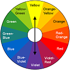
Take a look at the color wheel - a Complementary color scheme is simply any 2 colors that lie directly across each other. For example, red and green, yellow and violet, blue and orange and so on.
Color theory states that such colors complement and balance each other when used together, because they unite both warm and cool colors in one pallette.
NOTE: If you haven't already done so, please read "How to Choose Paint Colors Like a Pro" for more tips on using a color wheel in painting and decorating.
A Complementary interior color scheme is one of the most popular ones, because it is so simple to use. And even though it takes only 2 colors, there are so many looks you can achieve with it! You will choose one dominant color and incorporate its complement in accents.
Remember that for the best results, you should always customize all color schemes by changing the lightness and purity of the colors used in a given scheme.
Examples of Using
Complementary Interior Color Schemes
Red and Green
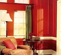
If you are craving color and bold hues reflect your personality and lifestyle, you can use complementing colors close to their full saturation. The result will be rather invigorating, just like in this photo where they used green draperies and bright red paint on the walls.
Even though the colors look really strong here, the combination is calmer than red and green in their pure state, and so is easier on the eye (pure green has been muted down to almost sage green, and pure red has been shifted more to tomato red).

See how different the same red and green color scheme can look when you change proportions and purity of each color?
Now the red looks very reserved, because it has been considerably toned down and is used sparingly in the room, while the calm green provides an almost neutral, relaxing background.
Yellow and Violet
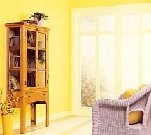
Let the sunshine in! No color is more cheerful than yellow, but not to overdo on the happiness, the complementing violet is used for balance.
Pure violet would have looked too harsh on such a light background, so it has been lightened up to lilac.

Here's a more restrained example of the same yellow and violet color scheme.
The colors have been toned down, where yellow looks neutral and unobtrusive, allowing the soft lavender (former violet) to come forth.
Orange and Blue

Here's a great example of using complementing colors at their full strength. The blue and orange combination (to be more exact, it's red-orange and green/blue) looks stunning, but since the colors are used in their pure state, they tend to compete for attention.
Notice how the pale blue touches in the decor help to reduce this clashing effect and provide a smoother transition between the 2 colors.

It's easy to recognize the same pale blue here, but can you believe it's (technically) the same orange on the walls (it looks almost beige here)?
Any color can be lightened up, toned down, muted or neutralized to meet your decorating goals. A color wheel gives you an idea, but it's up to you which direction you take it.
Recommended:

Recommended:

See Also:


Leave a Comment: