3 Yellow Paint Colors Later... Still Not Gold!
by Laura
(Grand Haven, MI)

Dining room walls before painting


|

|

|

|
Dilemma:
I painted my living room a brown color, "Peanut Butter" from the Home Depot, and I love it! In the photos, it kinda looks greenish, but in person it's not.I put up draperies of browns and muted gold with gold sheers and scarf.
I love that room. But it adjoins the dining room, which I envisioned a beautiful golden "straw" color. Not yellow, and not green/gold. But 3 colors later... still not Gold.
I started with "Refreshing Mimosa", and finished with "Palomino Gold". It is okay during the day, but tonight it's somewhere between tangerine and peach, and it hurts me to look at it.
AAARRRGGGHHHH!!!!!!!! I don't want yellow that hurts my eyes. I don't want cream color that bores me to tears. I don't want lemons, and I don't want tangerines or peaches.
I want the color of straw or hay, a gold that's beautiful in the morning sun that shines into my dining room through the slider, but it still has to look good in artificial light (we have incandescent bulbs in the ceiling fan light fixture, and fluorescent light coming from the kitchen).
Help?
Critique:
Laura, golds/yellows can be very tricky to get right. All paint colors intensify on the walls, but yellows especially so - and the pretty paint chip you like often turns out to be pretty crazy once the room is painted.For this reason, when you want a calm, muted yellow that is easy to live with, you want to select from the shades that look almost beige or tan on the chip.
Now, you asked for a straw yellow for your dining room, and while it's subject to interpretation, I can find quite a few shades in any paint deck that look like the color of straw.
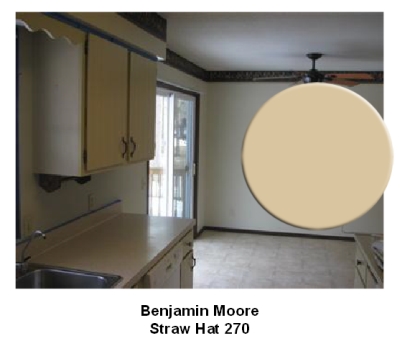
For example, Straw Hat 270 from Benjamin Moore:
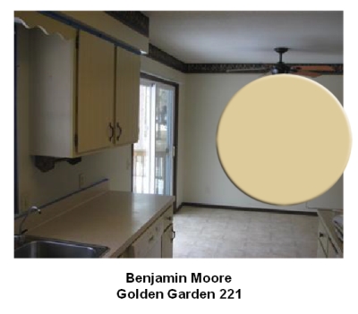
Or Golden Garden 221 (same deck):
But there is not much point in trying to find that perfect straw shade in a paint deck when the lighting conditions in your home affect the color so much (as you've seen for yourself).
In other words, the color you are looking for may look nothing like straw on a chip, yet in your home's lighting it will be just what you want.
You should know that fluorescent lights cast a greenish tinge, so if a paint color looks good everywhere else and greenish where the fluorescent light is, that could be part of your problem.
Just the same, incandescent bulbs give off a yellow light and make warm colors look even warmer.
Depending on the geographical direction your dining room is facing, the light coming through the slide doors during the day can also add a blue, green or orange to the wall color.
And even the greenery you have outside can reflect back into the room and make a yellow look greenish.
So the only way to really know how a yellow will read on your walls is by testing it.
Also, what are you painting over? The current wall color can make it difficult to judge a new sample if you paint it right on the walls.
So when you do a paint sample, do it on a poster board for an accurate color test.
Fold the painted poster board into a corner to give you a better idea of the way the color reflects off itself. Move it around the room to see how it looks on different walls and in different lighting.
And if the color doesn't work, you can try changing the light bulbs and see if that helps. You can also tweak the paint color based on your test, and try to counteract the effect of the natural light (for example, by choosing a cooler shade than you think you want - if the room faces West and the light adds orange).
But in the end, you may still have to compromise somewhere because your wall color will constantly keep changing in different lighting conditions - and that's the beauty of color (but also the problem with it).
So just decide when it's most important for you to love the color in the room (morning, afternoon or evening) and settle on that.
|
||
|
||
|
||
|
||
Recommended:

Recommended:


