Temperature and Weight of
Interior House Paint Colors
Did you know that interior house paint colors have temperature and weight? Find out why it's important and how to use this phenomenon when painting and decorating your home...
Chances are, you already know that interior house paint colors have temperature.
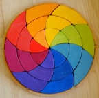
If you don't, here's what it means: colors like red, orange and yellow are considered "warm", while green, blue and violet are refered to as "cool" hues.
The higher the intensity of a warm color, the hotter is looks and "feels".
But what about colors having weight? You see, each color has its own level of strength. There are only two colors that have an equal weight when viewed at full intensity: red and green.
If primary blue and primary yellow are seen together in equal amounts, they will not appear balanced since the blue, which is deeper, visually appears larger and heavier than yellow ever can. Consequently a larger area of yellow would be required to balance a smaller blue area.
All things being equal, the visual weight of any color can be altered by its value: lighter colors will visually appear lighter in weight than darker colors. Because of this, a balance between yellow and blue, for example, can also be achieved by using a deep yellow and a light blue.
Coordinating Interior House Painting Colors
Based on Their Temperature and Weight
Now that you know the definitions, let's see how to use this knowledge for painting and decorating your home.
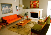
You probably know that the best-looking interior color schemes consist of both warm and cool colors. But that's not enough - to look balanced, the temperature of the colors has to be distributed around the room.
When decorating with paint or accent pieces, make sure not to over-use warm colors in one part of the room, and over-concentrate cool colors in the other - especially if working with high intensity colors (which can make the imbalance more obvious).
Likewise, if you are using dark or saturated interior house paint colors or dark furniture in your room, spread the weight of the color throughout the space.
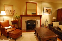
For example, if your room color scheme is relatively light, and you put a big, dark brown leather couch in one corner, the room will look imbalanced. The heaviness of the couch will overpower your decor and stick out like a sore thumb.
To correct this mistake and balance out the color's weight, you can paint the wall right across the couch with a rich brown accent color. Now both sides of the room will look proportionate.
So take a fresh look at your home: do the temperatures and weights of your interior paint colors look even or lopsided?
Recommended:

Recommended:

See Also:


Leave a Comment: