How to Choose Paint Colors
Like a Pro
Feel intimidated by color? Don't have a clue how to choose paint colors that will actually look good together? Relax, you've come to the right place for help!
If you want to learn how to choose paint colors like a pro and create beautiful harmonious color schemes and combinations for your home, spend some time on this website and you'll be well on your way!
In this tutorial, you will learn how to use a helpful little tool called the Color Wheel, and the same formulas professional interior decorators use every day in their work. The paint color wheel will give you ideas on how to put together different interior paint colors, so get ready to finally break the mysterious color code!
Learn How to Choose Paint Colors
With a Color Wheel
Choosing paint colors (to be more exact, getting ideas for combinations that can potentially look good together) with a color wheel is pretty simple - all you need to do is follow the proven successful formulas/schemes below:
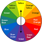
Complementary Color Scheme consists of any 2 colors lying on the opposite sides of the wheel.
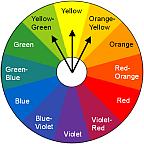
Analogous Color Scheme is created by combining any 3 colors lying next to one another.
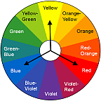
Triad Color Scheme is composed of any 3 colors that are set equal distances apart from one another.
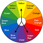
Split Complementary Scheme is defined as a color joined by the colors on each side of its complement.
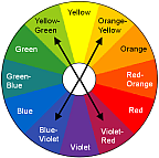
Double Split Complementary Scheme involves 4 colors, one from each side of 2 complementary colors.
As you study each of these color schemes,
keep the following in mind:
The color wheel shows you only the basic/pure colors - think of them as categories when creating room color schemes.
Pure/basic colors are seldom used in interior or exterior home color design, at least not together and not in large areas.
Every single color out there can be found on the color wheel and placed into one of its "categories" (with the exception of white and black - which are technically non-colors, and gray - which is their derivative).
You can and should modify the value (lightness/darkness) and intensity (brightness/dullness) of the basic colors in a given scheme, to ensure a less intense, more sophisticated and harmonious combination. Altering the value and intensity of pure colors within a scheme does not change their relationship to one another. For example, if you want to work with the yellow and violet Complimentary Interior Color Scheme, you can turn it into cream and lavender, or deep gold and amethyst.
Pale/pastel colors are the most forgiving and compatible. You can break away from the formulas/rules and create your own pastel color scheme - it is guaranteed to look good no matter what pastels you combine.
While you are still learning how to choose paint colors and combinations that work, try not to overdo the contrast. High contrasting values do create interest, but too much variation may look uneven.
In home color schemes that consist of 3 or 4 colors, use only 1 or 2 as dominant colors, and the others as accents.
The best way to memorize the formulas and positions of colors on the color wheel? Practice using them for choosing paint colors in real life!
Want a shortcut to picking paint colors like a pro?
Just get yourself a Pick, Point and Match Color Selector - it will turn you into a color pro in a second! Well, almost :)
You can use this amazing little tool to find ideas and paint color combinations for house painting, interior and exterior decorating, clothes, crafts and gardening. You will not want to leave your home without it!
Recommended:

Recommended:

See Also:


Leave a Comment: