Coordinating vs Matching
Paint Colours to Artwork
Matching paint colours to artwork and coordinating it with your room colour scheme? Here are some useful tips for best displaying your painting...
NOTE: have your seen "Wall Color, Art and Your Decor"? There we discussed the PRO's and CON's of matching paint colours to art and vice versa - art to a home color scheme.
Coordinating Paint Colors

Even if you are a "purist", and think that good art should always stand on its own, I'm sure you wouldn't argue with the fact that all colours can greatly affect one another. That means that the colour of your walls can either enhance your wall art, or visually argue with it.
So if the idea of colour matching makes you cringe, think colour coordinating. After all, why wouldn't you want to give your artwork the very best presentation?

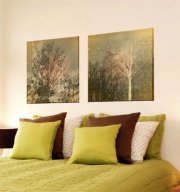
If you home interior is rather neutral (white walls and neutral furnishings), virtually any artwork will look good in it. But that is not to say that white walls are the best for art displaying purposes.
Art galleries know that some shades of white work much better that others, and sometimes the best way to show off a collection is to use a gray, beige, green or even yellow colour on the walls.
Depending on the current colours of your walls, furnishings and fabrics, certain hues in your painting will stand out more. Knowing this, you can strategically surround your wall art with colours that will bring out the hues in it you want to emphasize. Just experiment with placing your painting against different coloured backgrounds and see which one enhances your art the most.
Matching Paint Colours
While the idea of buying a painting to match your interior decor has a lot of opponents, using a painting as a room color scheme starter is a very popular and acceptable approach to home decorating.
In other words, instead of matching your art to your decor, your match/coordinate your decor with the art. A lot of successful interiors are created like this: you buy a painting that your love, and then use it as an inpiration piece to build your room color scheme around.
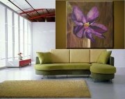
When using art as a color scheme starter, it's considered best practice to match your wall colours to the lightest shade in the piece, and repeat the bolder hues somewhere in your decor. That way, your painting will become the common thread that will tie all the elements of your decor together.
But always remember not to go overboard! If you do, your artwork can blend in too much - to the point of becoming un-noticeable. Or your decor will become too matchy-matchy and predictable (read: boring).
Even though in professionally coordinated interiors all the colors relate to one another, the best decors usually have an element of surprise present - a new, unexpected pop of color. So don't be afraid to let the art throw off your home color scheme a bit - sometimes a little surprise can be a good thing!
Recommended:

Recommended:

See Also:


Leave a Comment: