What Paint Color Combinations Are Best for Sponging Techniques?

Getting the contrast right in sponging is critical
Question:
What paint color combinations are best for sponge painting techniques?Answer:
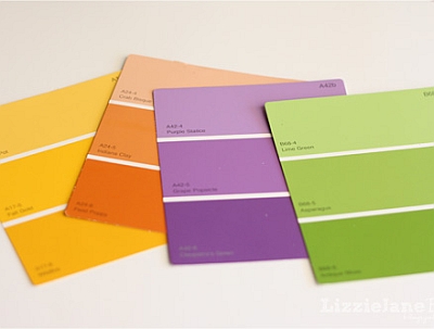
The most harmonious and eye-pleasing sponged ON finishes consist of 2 or 3 tones of the same color - usually the less contrast, the better.If you are picking your colors from a paint card, you can often use any 3 adjoining colors successfully, unless the card is not graduated properly (sometimes the colors on a paint card are not related).
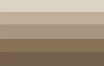
For sponged OFF effects, you can also choose 2 or 3 colors from the same graduated paint card, but here you'll pick a light, medium and deep color for your glazes (for example, a cream base with tan and light brown overlay coats) because the subtractive method requires a little more contrast to be visible.
Another way to create organic and well-coordinated color combinations for sponging ON is to choose all the colors from the same family - for example, a deep coral base with brick and burgundy overlays (the colors are all different and don't come from the same strip, but they all belong to the same red family).
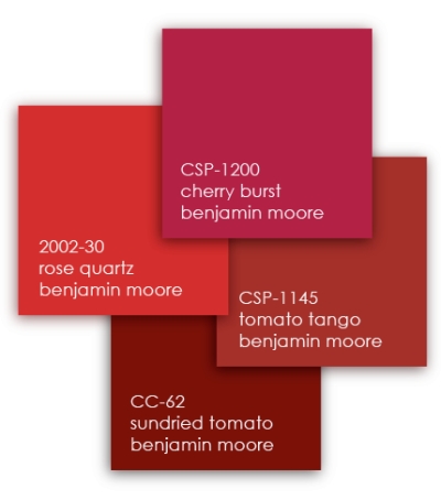
Sponging OFF can handle more drama, so you can even combine colors from related color groups - just look at the color wheel and pick any 2 or 3 adjoining hues (called analagous colors).
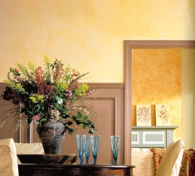
For example, you can successfully combine yellow with orange and green tones.

Just avoid using un-related colors together - such as orange and blue, or red and green - the end result will usually look very gaudy and dated (a la 1980s).
Finally, when layering colors, it's typically better to go from light to dark - in other words, use the lightest color on the base coat, then apply a medium color coat, and finally top it off with the deepest color of the three (if you are doing a 3-color application).
In reverse (when you use the lightest color on top), the final result will look as if the last color is floating off the surface, not blending into the base coat as much as a darker glaze overlay would.
This color placement also shows more application mistakes, and so is more difficult to work with, especially when there is a bit more contrast between the base and top coat colors.
Click here to ask your own question about sponge painting.
Return to Sponge Painting Q&As.
Recommended:

Recommended:


