Split Complementary
Paint Color Combinations
Split Complementary paint color combinations are derived from simple Complementary interior color schemes, and share similar characteristics.
How do you create Split Complementary paint color combinations?
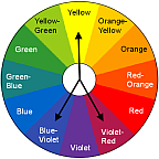
A Split Complementary color combo is an extension of a Complementary interior color scheme. It is created in a simiar way - just pick one color on the color wheel, but instead of pairing it with its complement on the opposite side, combine it with the colors adjacent to its complement.
So if you start with yellow, blue-violet and violet-red will complete the scheme.
This color mix includes both warm and cool hues - you can vary the visual temperature of your decor by assigning larger areas or deeper shades to the warm or cool part of the scheme, depending on your preferences. When working with color schemes containing 3 or more colors, the rule of thumb is to use one color on the walls, another as furniture color, and the third one in accessories.
Although high in contrast just like Complementary palette, the clashing effect within Split Complementary color combinations is reduced significantly. And since 2 of the 3 colors used here have a common undertone, the overall effect is more harmonious and coordinated. Finally, Split Complementary interior color schemes have more nuances and therefore look more interesting and sophisticated than their predecessor.
Examples of Split Complementary
Paint Color Combinations
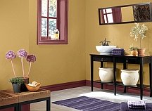
Can you see how similar this color combo is to the Complementary color scheme?
But while in the Complementary palette we pair down yellow with violet, here yellow is combined with blue-violet and violet-red.
The result is a balanced variety of muted shades.
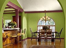
This lively decor is created with yellow, green and violet-red. The unusual thing about this decor is that each of the 3 colors are used rather generously on the walls, woodwork, furniture and accents, and almost at their full intensity. So if you would like to really crank up the mood in the room, you can do that by using the colors in equal amounts and by increasing their saturation.
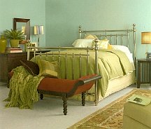
The abundance of green-blue and yellow-green colors in this room contribute to the peaceful and relaxing atmosphere.
The deep red in the settee upholstery adds a pop of bold color and some drama to the space.
Some people say that Split Complementary paint color combinations are a great choice for beginning decorators, because the chances of getting this color mix wrong are very slim.
Recommended:

Recommended:

See Also:


Leave a Comment: