Double Split Complementary
Home Color Scheme
Double Split Complementary home color scheme takes roots from the basic Complementary color combination.
How is a Double Split Complementary home color scheme created?
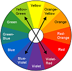
This scheme consists of 2 pairs of Complementary colors, forming an "X" on the color wheel. Yellow, green, red and violet represent one of many Double Split Complementary interior color schemes you can use for painting and decorating your home.
This palette will contain 2 warm and 2 cool hues, but you can always shift the temperature balance. For example, if you want to create a warm and cozy atmosphere, put the emphasis on the warm colors in the scheme - use them in wall paint, area rugs and furniture upholstery. To stay within the scheme, you will add the cool colors as accents. If you prefer cooler temperatures in decor, just reverse the above example.
Double Split Complementary paint color schemes offer a lot of contrast, interest and variety, but the downside is, they can become busy and mismatched if not balanced properly. If you are not experienced in working with colors, take extra care not to overdo the contrast - subdue, lighten or tone down the hues for a more sophisticated effect. Focus on 1 or 2 colors, and use the rest sparingly.
When composed properly, color combinations tend to pass unnoticed. But when the compositions clash, the result can be really aesthetically offending - this is especially true of this complex color mix.
Examples of Double Split Complementary
Home Color Schemes
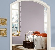
Here's a great example of a successful Double Split Complementary color combination.
The blue and violet dominate the space, decorative pillows add a splash of orange, and small yellow accessories complete the look.
Notice that 3 of the colors are similar in value/lightness, while the fourth one (orange) is much deeper, providing just the right amount of contrast.

This contemporary decor uses bolder colors. Even though the green has been muted, orange is used close to full strength. The painting on the wall adds the remaining colors of the scheme - high contrasting red and blue.
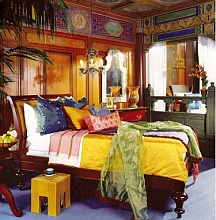
Take a look at these festive colors - red, yellow, green and violet!
Although interior color schemes rarely use such strong hues together in the same room (usually you will have to decrease their intensity), in this India-inspired decor they look very appropriate and relevant.
Recommended:

Recommended:

See Also:


Leave a Comment: