Interview with YELENA KUBLITSKI - creator of the Paint Color Cheat Sheets and editor of HousePaintingTutorials.com

Credit: all photos from HousePaintingTutorials.com
It's a funny feeling - writing an intro for an interview where the paint color expert is... myself!
But after someone interviewed me for their publication in October 2010, I decided to share that conversation with my readers and publish it here on my own site as well.
So if you want to learn more about the gal behind this website (yours truly) and how the Paint Color Cheat Sheets came into being, read on - I hope you won't be disappointed, because my story is anything but typical!
Yelena, you came to the US from Russia in 2002 fresh out of college, where you studied to be an ESL teacher.
Right now, you are the editor of HousePaintingTutorials.com - where you teach homeowners how to choose paint colors and decorate their homes with paint... What led you to pursue a career in color?
I guess, once a teacher, always a teacher! :)
More seriously though, I've always had a good eye for color (took it after my Mom), but it was only after I came to this country that I got involved with it professionally.
My husband and I own a house painting company, and right from the start we noticed that the most stressful and frustrating part of any painting project for most people was choosing paint colors.
Many customers changed their minds about the color several times during the project, some got stuck in the analysis-paralysis mode so we couldn't even start, and then there were those who had to go through up to 60(!) paint color samples before they found something they liked (or maybe they just gave up).
All that led to delays, rescheduling, a lot of wasted time and money for the customers and us.
So at some point we decided to start offering a complementary color consultation with every project, for sanity's sake of everyone involved.
Initially I didn't feel "qualified" to choose colors for other people (because I thought they would expect me to have some certificate or a degree - I didn't believe natural talent was enough), so I acted as an adviser or a "catalyst" instead:
I would probe and ask them questions, make suggestions, offer ideas, point out different aspects of the color, demonstrate how the colors changed based on context and so on.
My goal was to get the homeowners to see color and different combinations through my eyes, but at the same time to help them understand themselves better (their own style, preferences, tolerance levels, etc) so that *they* would be the ones making a final color decision, not me.
Well, it turned out that mine was a valid approach, because I've never had anyone complain that they didn't like the color after the room was painted!
It's because the homeowners took an active part in the color selection process, and made an educated decision at the end.
Later, I added some "proper" terms to my color vocabulary by reading decorating books and blogs (to better articulate what I was trying to show and teach), and when I started HousePaintingTutorials.com (to promote our painting business), I just continued helping people find the right paint color for their homes, only on a global scale now.
Recently you created a unique system for easily selecting paint colors for the home, called the Paint Color Cheat Sheets.
How did you come up with this idea?
A year or so into doing paint color consultations, I started to realize that not all colors in a paint deck were created equal.
What I mean by that is, some paint colors looked pretty only on a swatch - but totally wrong when applied to the walls (usually too intense, or the undertone was now more obvious and unattractive). Other colors were merely ok.
And then there were some that seemed virtually foolproof, because they looked great in all homes and all situations, and never disappointed - the "creme of the crop" in a paint deck, so to speak.
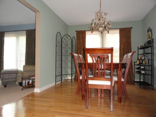
After a while, I noticed that I tended to reuse those "foolproof" colors again and again in my color consulting work. In fact, I felt a little guilty at first, because I thought that was "cheating" on my part... until I found out that other color consultants and designers also had their own "no-fail" color files for the same reason. Whew! :)
So I put the large samples of all my proven, go-to colors into a folder, and started taking them with me on my color consultations. The customers asked me about it, and when I explained, they loved the concept and wanted me to suggest the colors from my folder first. We never got to the paint deck after that, unless something needed to be matched exactly.
It was my customers who gave me the idea to turn my private color files into a system, and make it available to anyone who might need it. I did, and now homeowners from anywhere in the US and Canada can buy the Paint Color Cheat Sheets from my secure site, and have access to the same proven, tried and tested paint colors that have worked so well for me and other people (including professional color consultants - many own and use my Cheat Sheets in their work).
Selecting color is often very subjective - one person can physically “see” one color while another looking at the same paint swatch may “see” a different color.
Any recommendations for working with color taking into account this subjective factor?
From my experience, the subjective perception is the only thing that matters when you are helping someone choose a paint color for their home.
Sometimes all that's needed to get the customer on the same page with you is to point out certain aspects of the color you are suggesting (like the yellow undertone in a moss green), by comparing it to other similar shades in the deck.
Or you might need to demonstrate how the color changes depending on the context (by placing it next to different colors). Or to let them view it under different lighting sources to help them see what you see, and understand your recommendations and reasoning.
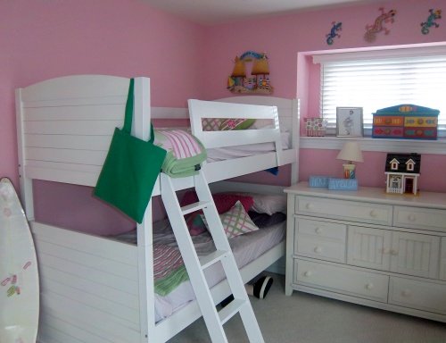
But if the homeowner sees black no matter what you do (when in reality the color in question is a dark midnight blue shade, for example), that's the end of story.
You can't persuade her to see a color that she is unable to see, for one reason or another (color blindness, illness, age). You just have to work within her range of perception.
That's why I always try to find out the customer's "color sensitivity" level first - their ability to see color nuance/undertones, how high/low they can go on a value scale before they stop seeing color, and how much intensity triggers their color tolerance "threshold".
That is invaluable info that makes color consultations go much smoother both for the customer and consultant.
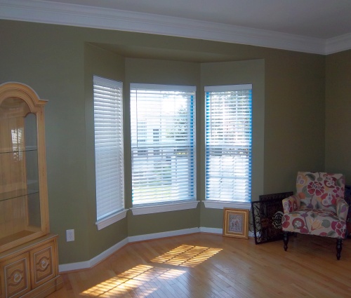
As 2010 color trends begin to fade into history, 2011 color forecasts are popping up everywhere.
As a color expert, what is your top color for 2011?
In my opinion, trends last for about a decade, while fads pop up every year.
I don't pay attention to fads at all - they might matter in decorating, but in house painting they are completely irrelevant (you don't want to repaint your house every year just to keep up with the latest color craze that will look passé or overused in a year or two).
For example, I haven't had a single client in 2010 who asked or even expressed interest in the hottest color of 2010 - Turquoise, as a wall color. The color of 2011 - Honeysuckle (pink) - doesn't readily translate into a successful paint color either for most people's homes.
The fad colors are nice to look at in decorating magazines, fun to play with via accessories that can be changed often, quickly and inexpensively, but they just don't work as well as wall colors in "real" homes.
The only reason to choose a fad color is because it's the perfect choice for that particular room/situation - not because it's "in" now.
Now as far as trends go, the latest one that recently started is all about cool neutrals. Grays are replacing beiges, tans and browns - and we do see that on all designer blogs and in industry publications.
However, the reality hasn't caught up yet as of October 2010 - most people's homes are still painted beige, and homeowners are still asking for warm neutrals the most.
Trends are slower to develop but they are much more livable and sustainable long-term.
Can you leave us with one last bit of advice with regards to choosing paint color?
Whenever you are looking for a "real" color for your walls (green, blue, yellow, etc), start in the Grays/Neutrals section of the paint deck first.
The colors in that section may seem blah and boring in the deck, but they will look very "grown up" and sophisticated when applied to the walls, adding just enough color - but never over the top.
It's when you pick from the Brights section of the deck that you usually get into trouble and end up with crazy "laundry room yellow", a kiddish "toothpaste green" and similar color disasters.
The Brights look very pretty on a tiny chip, but intensify dramatically on the walls - not a good look for most living spaces.
|
||
|
||
|
||
|
||


