Interview with JEAN MOLESWORTH KEE - architectural paint color expert
by Yelena Kublitski

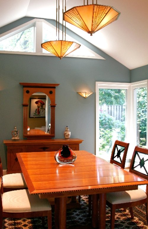
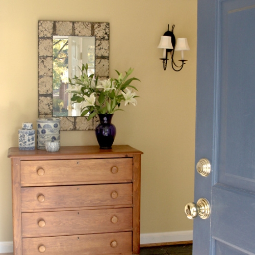
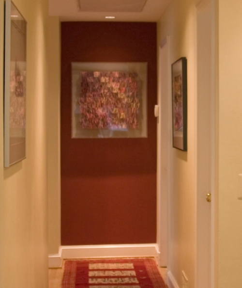
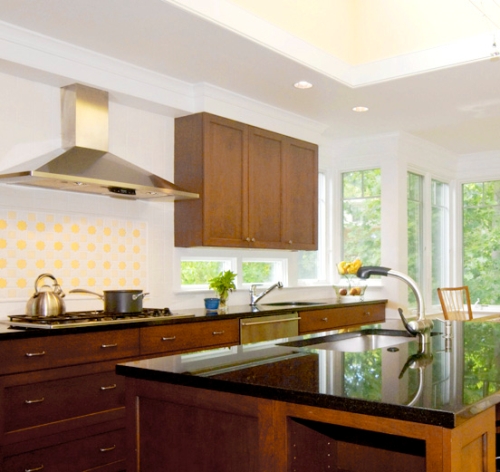
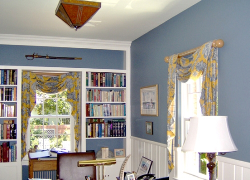
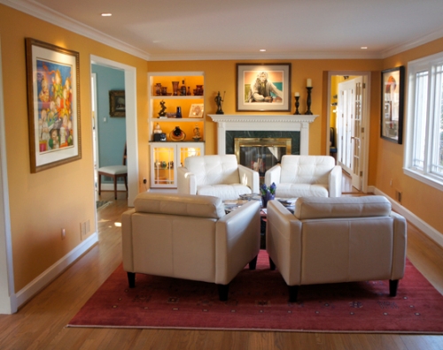
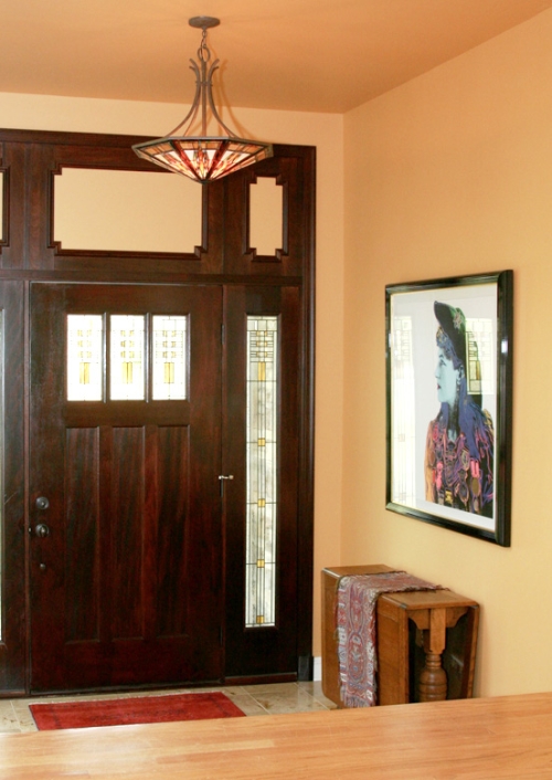
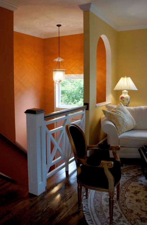
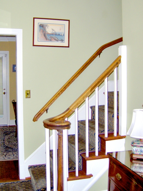
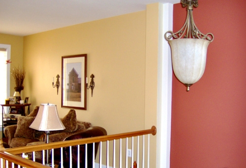
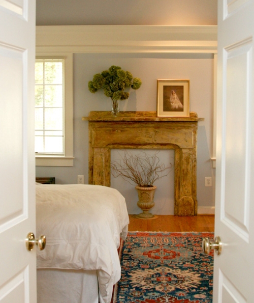
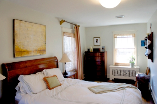
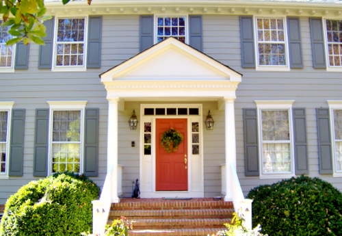
Credit: All photos from PaintedRoom.com
Don’t you love it when a color expert has a great sense of humor?
“When you get to heaven, you’ll discover it is Benjamin Moore Linen White” – that’s the tagline Jean Molesworth Kee once used to have in her Twitter account.
Witty yet approachable, Jean has a talent for expressing her color genius simply and eloquently.
So pour yourself a cup of tea – you’ll want to savor the insights, and I’m sure you’ll get many from this interview!
Jean, can you share a few key things about yourself, your background and what led you to pursue a career in home color design?
I’ve been a lifelong student of design — must have come from my mother who has impeccable taste and taught me to appreciate beautiful things.
She was a schoolteacher but always dreamed of attending the Parsons School of Design — she still channels her creative energy to me with great blog recommendations!
I have a liberal arts degree, but realized my passion while living in Sydney, Australia - where I attended ISCD and spent hours and hours mixing paint and studying color and design in a studio facing the Sydney Opera House — hard to top that experience!
What part of your work do you love the most and why?
In this urban Washington, D.C. area I work with many Type A clients who seem to really value their home as a sanctuary and respite from the outside world.
Many have some idea of the result they want to achieve but have become frustrated experimenting themselves — I’m often called in after a client has bought 10 pints of paint and is totally exasperated.
I just love bringing order to that whole process and clients often literally swoon with the results. That’s a nice feeling — to see a happy lawyer!
In your opinion, what is the biggest difference between how YOU see color, and how most homeowners see it?
I see color in a larger context — in the interplay of all planes of color in a room - walls, ceiling, and floor, as well as views to the outside and to adjoining rooms.
I consider the big picture and strive to create harmony and visual balance.
I also understand how those tiny chips translate onto a wall — a source of enormous angst to the untrained eye.
What is your signature decorating style and how would you describe it?
I would say — country modern. I love crisp, clean, minimalist spaces infused with warmth - the unexpected interplay between the two.
I think the Swedes are the ones who really got it right. And yes, I’m a “white” groupie - but the perfect white of course!
What recommendation can you give to homeowners who would like to discover their own signature styles?
I encourage clients to keep a file of images that appeal to them — there is usually a consistent thread there that helps me to translate their dream into reality.
There is great value in first getting the “bones” of a house right, keeping scale in mind with basic furnishings, then simply surrounding yourself with things that you love whether that be antiques, books, art... or dogs!
How do you know when a color combination works? When do you stop tweaking?
I often know what will work before it goes on the walls but this isn’t always the case. Testing with large samples is almost always critical.
To my clients, the result often cannot be appreciated until those large planes of color are broken with artwork hung and furniture in place.
What is your process for specifying paint color?
During the first on-site consultation I ascertain what “atmosphere” the client is trying to achieve and look closely at the architecture of the room, the lighting conditions and the “givens” such as floor surface, window trim color, and views to adjoining rooms.
I usually return to my studio and develop several palettes that might work. Clients like having choices, especially when they are making a drastic change. I then return and do color testing with large samples.
When color decisions are final, I email a detailed paint schedule for contractors to work with — specifying colors and sheen levels. And yes, there is often some hand-holding that goes on as the paint goes up on the walls — very scary for many.
Is there one piece of advice you could give, that would move homeowners just one step closer to choosing the right paint color for their homes?
Hire a professional! Paint color is the most easily controlled element of a well-designed room. It is the least expensive yet most powerful decorating tool.
The cost of painting is largely labor — buy the best quality paint you can afford and get it right the first time!
What's different about choosing paint colors for open floor homes?
Obviously, there must be a unifying element to make the spaces flow. This could be a single wall color or a continuous flow of trim color.
I often encounter awkward angles and surfaces in remodeled spaces that must ultimately be “painted out” to dissolve boundaries so that the eye is drawn away from them.
Color choices can control where the eye goes and in an open space color can be used to hide deficiencies and to showcase strengths.
What is your biggest pet peeve in the current painting and decorating trends?
I am annoyed by perfection — a space that is too matchy-matchy or predictable. There should always be the element of surprise in a room, otherwise it is boring.
And don’t get me started on people who buy a painting to match their sofa!
What is your home color and design forecast and what do you see happening in the next 2 years?
Simpler, smaller, cozy and functional spaces designed to LIVE in rather than to impress. I’m a big fan of the Sarah Suskana movement and the “Not So Big House”.
Color for nurturing, tranquility and comfort will be big.
What are your career goals and plans, and where do you see yourself in the next 5 years?
I would love to have a successful blog within the next year. Social media is making it easier for color professionals to connect and I would love to collaborate with others to teach and speak on the subject and of course to grow my business.
What are the 3 things nobody knows about you, but you wish they did?
I am fearless, except when it comes to horses and my daughter’s piano teacher!
I love to swim in the Atlantic ocean.
I spend at least 15 minutes a day looking for my glasses and car keys!
What is your secret to success as a decorator?
Listening, listening, listening to my clients!
If you are lucky enough to live in Jean’s serving area (the greater Washington, DC region), you can hire her for an on-site paint color consultation – just go to PaintedRoom.com
Or, you can work with her remotely - Jean also offers exterior consultations via mail.
|
||
|
||
Recommended:

Recommended:


