Interview with CATHLEEN DAVIDSON - paint color consultant and interior designer
by Yelena Kublitski

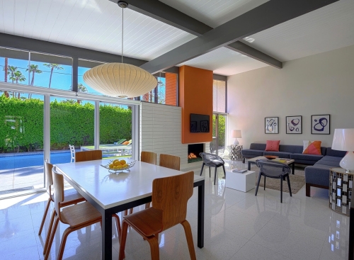
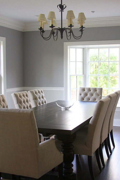
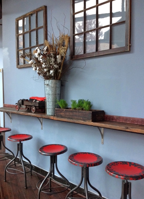
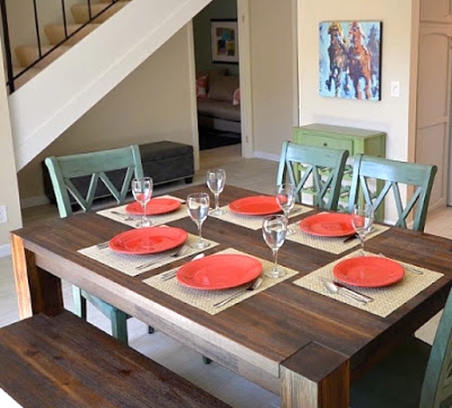
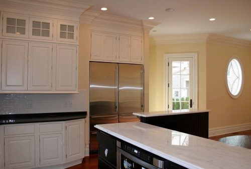
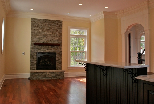
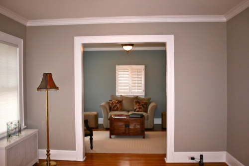
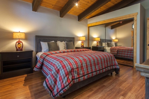
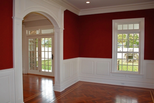
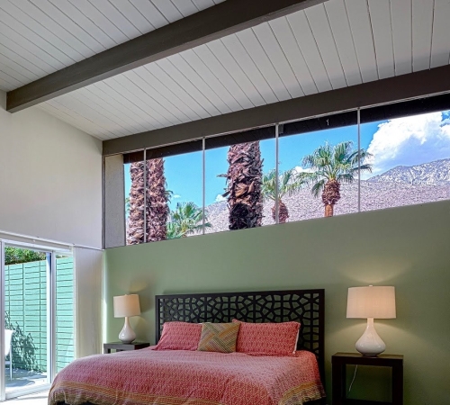
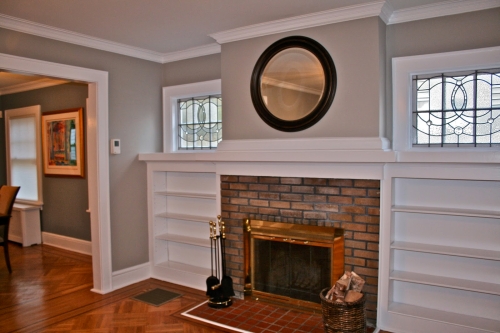
Credit: All photos from ColorForte.com
Just like her designs and color schemes, Cathleen Davidson is a wonderful mix of whimsy, excitement, and ambiance.
In her own words: "I love life. All of it. Especially color and design. It delights my senses, stimulates my mind, and moves my soul. Not a day goes by when I am not awed by some amazing color phenomenon or blown away by the sheer beauty of it."
So feel free to eavesdrop - as I interview Cathleen about her sensual love affair with all things color!
Cathleen, can you share a few key things about yourself, and what led you to the home color and design industry?
Color is a way of life for me. Love everything about it.
Whether it’s a pristine sunrise, sizzling sunset, or a simple routine of mixing cream in coffee, I delight in visual phenomena.
So one day I woke up and decided to pursue my passion. Left the corporate world, enrolled in Parsons School of Design, and have been designing ever since.
In your opinion, what is the biggest difference between how YOU see color, and how most homeowners see it?
I see color as alive, dynamic and ever changing. Most homeowners see color as unchanging and static.
They don’t notice its chameleon properties, or realize that color is all about context.
They are amazed when I show them how color changes with its surroundings.
Do you have a signature color and design style? How would you describe it?
My design style is alive with personality, a bit of whimsy, a dose of excitement, and tons of ambiance.
I feel design is life art; we don’t just look at design, we interact with it. Color and design should make us feel special everyday.
What recommendation can you give homeowners who would like to discover their own signature styles?
There are many resources such as art, magazines, design shows, movie sets, nature, restaurants, etc. to get ideas from.
But homeowners should look within, at their own lifestyle, personal possessions, and their favorite things to do for inspiration.
One of my clients got her inspiration from her favorite vacation resort. We designed with that sensibility in mind, and now her home is her sanctuary.
What's different about choosing paint colors for a new construction home? Any tips?
New construction is one of my specialties!
Choose paint colors after all the fixed finishes are done.
Also, choose the paint color after the decorative furnishings are selected. Get samples and look at everything in the space.
When that is not possible, choose neutral colors in the main areas. By neutral, I don’t just mean beiges and whites, but colors that are versatile.
Colors can be more expressive in a kitchen, and more dramatic in dining and powder rooms.
And as always, the paint color in all rooms should get along with each other, and create a harmonious flow as you walk from room to room.
Do you have any tips specifically for open floor plans?
I generally prefer one paint color in an open plan, because it reinforces the open theme.
Painting an open space different colors will visually separate the space, and define boundaries.
But of course, it all depends on the look and feeling we are creating.
How do you ensure the wall colors flow from one area to the next?
There are many ways. Good designers have a gift of seeing color, have an intuitive sense of what works, and are color wise after years of trials and tribulations.
I tell my clients that the interaction of colors is a lot like human relationships.
Some get along beautifully, some don’t get along at all, and others fight, scream, and yell at each other. The goal is to pick colors that get along. A match made in heaven!
Test the colors in the space. Trust your eye. They either get along beautifully, or they don’t.
How do you know when a color combination works? When do you stop tweaking things?
It is imperative to know when to stop. Too many designs are forced and overdone.
A good designer just knows, it’s a natural inclination.
When you walk into a room for the first time, how do you decide what paint color to specify?
I choose color like an artist; the walls are my canvas.
When I first walk in and interview my client, I get an initial feeling and vision of what color will look beautiful.
I take an interactive approach and design with large paint boards in the space. I engage my clients in the process to make sure they love the colors.
What is your biggest pet peeve in the current painting and decorating trends?
I like to think outside the box. Trends are too confining for me.
But I follow the latest trends, and take from it what I want.
What is your home color and design forecast and what do you see happening in the next 2 years?
I think design will continue its momentum into popular culture, and will be even more accessible to the masses.
As far as color, especially paint, I predict the focus will be on its power to affect our moods, health, and quality of life.
How a color makes us feel, will dominate.
What are the 3 things nobody knows about you, but you wish they did?
My three favorite things to do, besides color and design, are traveling, watching a Shakespeare play, and wining & dining... outside, overlooking a drop dead gorgeous view.
To see more examples of Cathleen's work (photos of completed paint color consultations, kitchen design and room makeovers), visit her blog: ColorForte.com
She works with her clients in person, on the phone and over the Internet, and can be reached at (914)924-0813 or via email: tocathleen@yahoo.com
|
||
|
||
|
||
|
||
|
||
Recommended:

Recommended:


