Interior Paint Schemes:
Do Yours Pass This Test?
The best interior paint schemes have some things in common. See if your own paint color schemes pass this test, or maybe you need to improve them?
If you study home decorating color schemes created by talented designers, you will see that most of them share the same characteristics. Even though they all will look different, there will be a common thread of underlying principles that make them work.
So take a look at your own interior paint schemes: do they pass the test?
Do Your Interior Paint Schemes...
...consist of 3 to 6 colors?

The most attractive and popular room color schemes usually consist of a minimum of 3 colors. Anything less than that and your rooms can get too monotonous, boring and imbalanced.
But to comply with this "rule", you don't have to use drastically different colors in your decor.
In fact, even a monochromatic paint color palette can look interesting and diversified - you simply add variation through textures, patterns, darker/lighter and saturated/muted shades (yes, different shades of the same color "count" as a different color).
Why do you have to limit yourself to 6 colors in your home color schemes? Because the more colors you use, the more difficult it becomes to control, balance and coordinate them all together - especially if you are a novice when it comes to working with color.
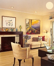
...have relating hues?
In most successful interiors, there is a relationship between all the colors. The colors can relate on different levels (but of course, not all at the same time):
they can stem from the same color (for example, different shades of green - if it's a monochromatic room)
they can have the same temperature (note that warm colors can appear cool, and vice versa - see "Room Color Temperature" to learn more)
they can share the same intensity (for example, all the colors used in the room are muted/subdued)
they can relate based on their value - lightness/darkness (for instance, the entire color scheme is pale)
they are repeated and used interexchangeably throughout the space (that's how you create a theme)
their undertones are in harmony (see "Interior Paint Color Undertones" for more)
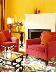
...contain an element of surprise?
Even though matching and repeating colors is important for creating a feeling of flow in the space, make sure you don't go overboard - otherwise your interior paint schemes can become too matchy-matchy, predictable and "made".
You don't want your decor to look like you were trying too hard. The best interiors look almost effortless.
How do the designers do it? By adding an unexpected pop of color with an accent piece, or some stunning artwork. This "pop" can, but doesn't have to be a different color - it can simply be a darker, lighter or bolder version of the color that you already have in the room.
So how do your interior paint schemes measure up? Is there room for improvement?
Recommended:

Recommended:

See Also:


Leave a Comment: